Planting a Floral Collection
Creating both patterns and non-patterns using a shared shape theme.

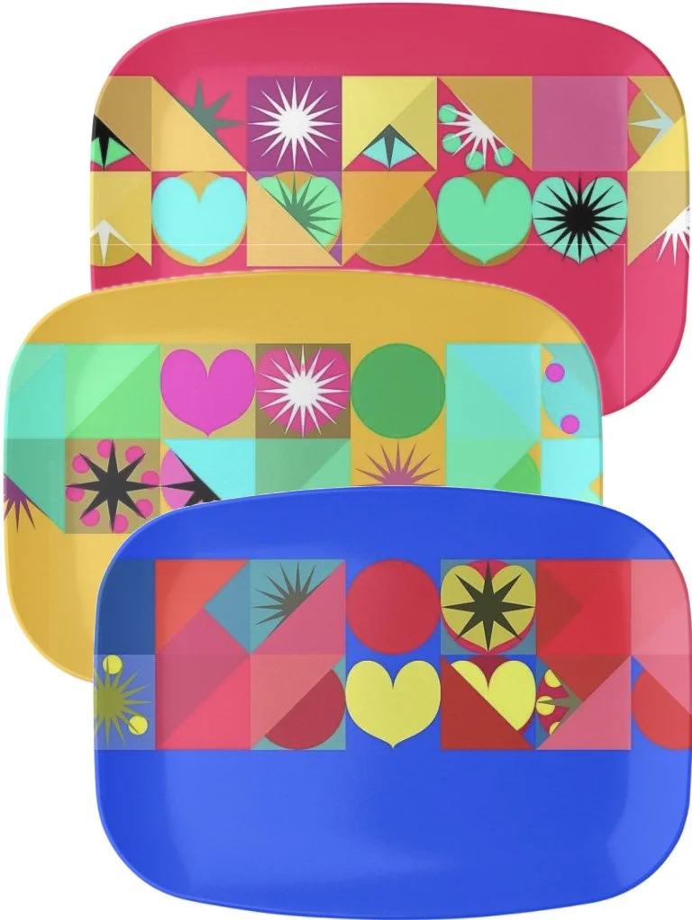
Three of the 2025 Floral Collection Platters
Our neighborhood Art in the Gardens event inspired me to create a flower themed collection of melamine platters. I had about six weeks to prepare, but knew there was also a production lead time of up to three weeks. Political uncertainty also played into the exercise as fickle decisions impacting supply chains were likely.
In previous years, I’ve created melamine platters for Art in the Gardens. The first years designs were based on a string of rectangles filled with a set of randomized triangles, circles, and hearts set on a strong background color. These platters had a strong mid-century modern take. The sophomore years platters were themed on a stylized flower, blooming in sets of three, with a narrow stem and grass-like foliage. These windflowers were on a background composed of a circle representing either the sun or the moon, and two interacting transparent rectangles, one representing the horizon, and the other placed vertically.
Three of the twelve 2023 platters

Three of the sixteen designs in the 2024 Windflower Colllection
The floral collection for 2025 Art in the Gardens would be subtle in the background - very light desaturated greens which would read as not white. Flowers should be tropical feeling, but still abstract. The flowers should be placed to cover most of the surface of the platter, but not identifiable as rows and columns. The flowers should vary in size and color. The collection should at least have twelve variations, but more would be preferred.
Creating variations
In most of my surface design work, I use a tool called NodeBox 1. NodeBox was developed by EMRG (Experiment Media Research Group) which is associated with the Sint Lucas School of art of the Karel de Grote-Hogeschool in Antwerp, Belgium. The details about NodeBox can be found on their site: www.nodebox.net
NodeBox 1 creates PDF output which can be easily opened in Adobe Illustrator. NodeBox 1 programs are written in a subset of an older version of the Python language.
One negative aspect of NodeBox 1 is that it has not been updated to run on recent versions of Mac OS. I keep a separate computer (a small Intel MacMini) which is never updated, and never attached to the internet just for running NodeBox 1.
My favorite tool in any computer language is the random function. This permits me to have objects vary in size, in color, in location, in rotation, and / in the 2025 floral collection - the number of petals. The trick is to constrain the randomness - size should not vary from infinitesimal to infinite.

Preliminary shape studies
I start programming by opening up an existing program so I have previous work to build upon. I previously created functions to select a hue from one of the twelve segments of the color wheel, along with a functions to constrain the random function.

More spacing studies
I never try to create the program in one step. In this case, can I put circles where I need them on a rectangle that defines the platters boundaries? Are they distributing in a pleasing way?

Still more spacing issues, and a bit too much color variation in the petals
Early on I decided that total random distribution of the shapes was not working. I decided that a run of three rows of four columns of flowers would fill the platter shape. I added randomness to slide the flowers away from the twelve exact points as well as continuing with randomness in the size of the flowers, and in the rotation of the flowers.

Twelve flowers ended up looking a bit sparse
However twelve flowers were leaving significant gaps, and did not have a “flowers strewn about” feel. So six more flowers were added, with their location in between the existing 12 flower locations. Of course, these new locations were still approximate with randomness added.

Eighteen flowers fill the gaps in the composition
Another decision was what color to make the flowers, and should each petal of a flower be the same. I decided to allow randomness within a segment of the color wheel. I previously created a function which would return a hue value from a color wheel segment. However if I requested red, it could be a red leaning close to the red-violet segment, a ‘pure’ red, or a red leaning close to the red-orange segment.
The sepals beneath the petals were drawn first. In this instance the hue was select from the color wheel segments spanning yellow-green, green, blue-green. The brightness of these colors was set to 50%, but with full saturation. The sepals were also set to 65% of the flowers circle radius. I liked this ratio of sepal to petal and did not add any randomness.
The center of the flowers I referred to as their stamens. Apologies to any botanist as these are extreme abstractions of any actual structures. Similar to the sepals these were set to 25% of the flowers circle radius. An additional randomness was added to the drawing of the stamens - a random rotation of up to 60 degrees. The color is random, but by reducing the saturation, reducing the brightness, and reducing the opacity to 60% the stamens sit well upon the petals.

Example of the flowers without stamen rotation
So how many petals?
Some of my first experiments were three petals. What I settled upon for the platters was between three and six petals. However this can adjusted by changing one value in the program.

Experiment with flowers having between three and nine petals
What about the shapes of the petals?
The petal shapes are Bézier curves. If you are familiar with Adobe Illustrator these are the curves you create using the pen tool. Each individual petal / sepal / stamen is created from just two curves
Editing and printing
After producing the designs I liked, I ran the program and saved twenty five results. Of these I opened up in Adobe Illustrator and selected twenty for printing. These were then saved as JPG files and emailed off to be printed as melamine platters (approximately 13 3/4 inches by 10 inches in size).
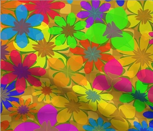
Turning the floral design into fabric
After creating the platters, I thought it would be fun as a tropical print fabric. There are a few differences to consider.
Platters require a photo print resolution of 300 dots per inch (pixels per inch to be more exact.) Fabric generally requires a resolution of 150 dots per inch (DPI). A higher DPI on fabric leads to fuzzy images as the threads can only take so much dye - you can’t really dye just one side of an individual thread.
Fabric also requires that the image is designed to repeat. There are many ways to set a repeat, but in my case I was planning on a simple rectangular repeat. Simplifying the print further, I decided on a square pattern.
I started with a matrix of sixteen flowers, four across and four down. This ended-up being a bit sparse, so I added another sixteen in between.
Besides the original square image, I also simplified the calculation of the overlap by repeating the drawing each flower nine times - up and down, left and right, the four diagonals, and of course the original square.

The center square and the eight surrounding squares. Each have the exact same content with the exception that the center square has a black background.
Once the designs were being created to my liking I opened them in Adobe Illustrator, trimmed off the repeats, and saved them as jpegs. Since the print is rather bold, I saved them as 3600 pixels wide, so at 150 DPI the fabric would print using a twelve inch repeat.
The advantage of having the program handle the repeats was that in proofing I found no problems with the repeats.
Future plans for this series
I will continue to create new series based on where I left off. I’ve already played with some new backgrounds other than solid colors, and want to investigate adding foliage and cast shadows. Thematic colors may be open to investigation along with monochromatic studies.